Filed under: Week 5: Design principles

CRAP is an acronym for the four basic design principles;
- Contrast
- Repitition
- Alignment
- Proximity
This weeks blog gives a critique of http://www.cit.ie
Contrast
This website uses the traditional black text on a white background while the footer is inside a light blue section making it very easy on the eyes and also appealing. There are two types of links. The top navigation and the navigation links on the left highlight the section of the link once it is rolled over, while the links to news items and events underline once they are rolled over.

Repititon
This website has a lot of repetition but useful repetition. The header is repeated throughout each page as with the colour scheme of a white background and black text. This signals to the user that they have not left the website.

Alignment
The website is split into different table sections so as to keep it aligned. There are at least nine sections on the homepage while the website uses left aligned.
Proximity
In terms of proximity, all related areas are located close to one another. In this case there is a consistent navigation bar on the left while the homepage is split into section for news, events and useful links, making the website easy to use and navigate.
References
http://www.myinkblog.com/2009/03/21/4-principles-of-good-design-for-websites/
http://designerside.com/article/four-basic-design-principles
Find out more on the Crap principles http://www.screenspace.org/?p=80
Filed under: Week 4: Kevin Kelly's Speech

This week’s blog focuses on the speech given by Kevin Kelly on the World Wide Web. One point that I found interesting was the statement that Kevin Kelly made about the Web, “It’s the most reliable machine ever made…..zero downtime”. This interesting as in the end the Web is a machine, man made and there to serve a purpose. The Web is one of the most complex machines ever made, always on with no interruptions which is astounding considering our reliance on the Web.

The second point I found interesting which ties to my first point is the reliance on the Internet since its inception over the last 5000 days and the vast functionality it exibits.

References
Watch the video @ http://www.youtube.com/watch?v=yDYCf4ONh5M
Filed under: Week 3: Government website accessability analysis
This week’s blog assignment was to select a public website from the list located at http://www.gov.ie.en/sites and discuss the site’s accessibility with regards to
• Tools
• Layout
• Design
• Structure.
After looking at the list of government pages I decided to choose http://www.irishrail.ie as the chosen website. I did this because the Irish Rail website is one that I have used before and therefore I can look at it from an ordinary customer’s perspective. The Irish Rail website is used for people traveling on rail services including the dart whereby they can access timetables, news, prices and also book tickets.
Tools
This webpage has been adapted so that users using screen reader software can easily access timetables in a more structured, user friendly and efficient manner while also have a link for visually impaired users. While this is excellent, you have to ask the question could they not have incorporated these into the main page instead of having to be taken to a new page to avail of this service.

Layout
This site is generally well laid out due to being divided into sections. On the left there is a navigation links, Reservations and Times section to the left center incorporating a form, the right center has a fare details section however this is more of a promotion section as this information is not interactive. The right hand side has a travel alerts and news section which is well laid out.
Design
The website is well designed incorporating the colours green and white which are the colours of the inter city trains. The only issue I have with regard to the design of the website is the links. There are links on the left for home, my account, fares, timetables and more information. While on the bottom there are links to external websites that may be of benefit to rail users such as hotels in Ireland. None of these links are immediately identifiable as links as both sets are images and the links on the left have a downward facing arrow that suggests a dropdown box. However all these links do have a description when they are hovered over. There are further links on the right which relate to various travel news items while a different colour has been defined for rollover but not for visited links.
Structure
In terms of structure the web designers have done a great job. The website is user friendly and easy to us while also being accessible to disabled users.
This is a well organised Web site that makes it easy and intuitive for visitors to find what they want. The easier a website is to use, the longer users will stay at the site, and the more they’ll see of it. Good website structure also makes it easy to grow the site logically.
Finally in most areas of this site, every page is no more than two levels deep from the home page (i.e. it takes not take more than two clicks to go from the home page to every other page).This is a great structure as otherwise, the search engine spiders may not index all the pages.

References
http://www.irishrail.ie
http://www.buildwebsite4u.com/building/structure.shtml
http://www.gov.ie/en/sites
Filed under: Week 2: Web Design and the 5E's
Nowadays it is easy to produce a website with the emergence of programs such as dreamweaver. Previously hardcoding websites may have been hard or at least extremely time consuming but now with these new programs that generate most of the basic website code for you, there is no excuse for not having a website that is user friendly, well laid out and has a high degree of usability.
In order for a website to be of high quality and satisfy its target audience it must conform to the five E’s of website design. These suggest a website must be,
- Effective
- Efficient
- Engaging
- Error Tolerant
- Easy to learn.
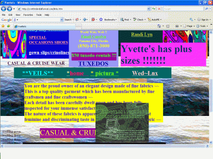
While there are many websites on the web that do not conform to these, http://www.yvettesbridalformal.com has to be mentioned.
The first thing that I would mention is that it is by no means easy to learn. The website is filled with different colours, links scattered throughout the page and hideous backgrounds. If it wasn’t for the URL of the site, I would struggle to come to the conclusion that this in fact is a bridal boutique. There are also none of your basic links such as about us , while the text of the page that isnt’t( but still look like) links seems to be mostly English however there is some degree of French and philosophical quotes thrown in for some reason. Running through the different links will only add to your confusion as every page seems to be as hard to understand as the next. When you eventually find something on the page that is worth reading there is a moving image moving across the screen.

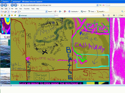
This site is by no means effectives it does not serve its purpose. Target customers will not revisit the site and probably not stay on the site long enough to avail of any useful information that may be available on the site. The only information of any use that I could find on the website which I am assuming is a bridal boutique was there opening hours whereas the map to the store one would assume is a joke!!!

Yvette’s website is seriously lacking efficiency with the layout of the page and the links. While there is no reason for all the images, the moving image has no relevance to the boutique whatsoever. Furthermore each page plays a different song through a plug-in which is a waste of resources.
The last point I would like to make about Yvette’s is would you shop here with the extreme unprofessionalism that they have displayed through their website?
References
http://www.yvettesbridalformal.com
http://www.websitesthatsuck.com

